
 Everybody knows that we change jobs more often than we used to. Better still, in the Golden Age of employment, there were way more lifelong positions than there are now. Yet if you ask someone who is making that assessment when was this blessed era for all workers (though it’s unclear whether it also applied to women) and whether they have any ounce of proof to support their statement, you’ll be greeted either with an embarrassed silence or with an eloquent “What the hell are you talking about?”…
In fact, nobody ever answers those two questions. Indeed, no one ever gave me a reliable source to support this apparently obvious truth. Nevertheless, data sets are available to study the issue. I’ll present three of them.
Job tenureStatistics Canada’s Labour Force Survey (LFS) contains data regarding the duration of employment with the same employer. One’s position might have changed, but there must be no termination of the employee/employer relationship. The following graph shows the evolution of tenure according to sex from 1976 to 2012.
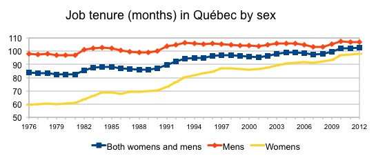
As you can see from the graph, the average job tenure (blue line) has gone up from 84 months in 1976 to 107 months in 2012, a 23% increase. In fact, the increase has been 9% for men and 64% for women. The latter increase mostly results from the growing presence of women on the job market. Indeed, when their employment rate started reaching that of men, precisely in the 70s, they had more recently entered the job market and had a much lower average job tenure. As these women grew older, their average tenure increased.
The graph can also be misleading for another reason. Much of the increase in job tenure is due to a composition effect associated with the aging workforce: since a larger proportion of the population which has a job has now been on the job market for longer than in 1976, it’s expected that the average job tenure should be longer. The following graph erases the composition effect.
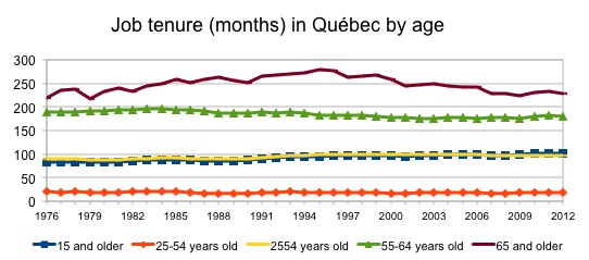
Actually, this graph shows very little movement! There is a slight increase in tenure for people in employment aged 25 to 54, but a slight decrease for those aged 55 to 64. This data set, which covers over 35 years, does not allow us to solve the issue. In the end, it shows no sign that we would be changing jobs more often than before nor that life-long jobs are any less frequent.
Completed Duration of a New Job
The study entitled Job Tenure, Worker Mobility and the Youth Labour Market During the 1990s addresses much more directly the questions asked at the beginning of this blog post than the previous data set. Its main defect is that it dates back to 13 years ago (March 2001).
Rather than take a photograph of job tenure at a given point in time, as did the LFS data presented earlier, the authors of this study are instead trying to “estimate the average complete length of all jobs that start at a point in time.” The exact method, based on the probability that someone with a job will keep that job for a certain time, is explained in detail in footnote 2 of page 8 of the study.

We can see the result of this estimate in Chart 7a, on page 9 of the study, which I’ve reproduced. As you can see, whilst the average duration of new jobs declined in the 80s, it increased more in the 90s, jumping from 34 months in 1991 to 53 months in 1999. Table 2 of the study (on pages 10 and 11) shows that this duration increased for both men and women, younger and older workers as well as for all education levels. This table also shows that the average duration of new jobs is much higher for the most educated workers than for those with the least education. However, with increased schooling, it seems “normal” that the average duration of jobs would be getting longer and longer. Chart 7c on page 10 also shows that the odds of starting a job that will last more than 20 years (which we can take to be a lifelong job) were relatively low at the end of the 90s (less than 10%), but that they were even lower at the beginning of the 80s! All in all, it is true that lifelong jobs were rare at the end of the 90s, but they were even rarer twenty years earlier.

The authors then directly address the issue of changing jobs. “There is a notion that people are moving among jobs and firms more rapidly now than during previous decades,” they say. To estimate the number of employers a person will have over the course of their career, they “compute the expected number of starts with any company that a person would have over their lifetime assuming the age-specific hiring rates of the current period.” The method is explained in detail in footnote 5 on page 11 of the study. Chart 8 on page 12, which I’ve reproduced, shows the estimated number of employers over a lifetime went from more than 8 in 1976 to around 7 in 1982, before reaching 9.5 at the end of the 80s and stabilizing around 7 and 7.5 at the end of the 90s. It should be noted that the authors have excluded from their calculations positions held by students, and that half of these employer changes occurred before the person hit 35. These calculations nonetheless run contrary to conventional wisdom… That being said, did this trend keep on going afterwards?
Another method…
Statistics Canada published in 2012 another study on the same topic: An Overview of the Working Lives of Older Baby Boomers. Interestingly, it relies on different data sets than that of the two previous sections. They come from the Longitudinal Worker File (LWF), “based on a 10% random sample of Canadian workers,” constructed from personal taxation files (T1), tax information slips (T4), Record of Employment Forms (handed in when employment is terminated), and Statistics Canada data on businesses.
Hence, instead of calculating the odds of keeping a job as in the previous study, this data makes it possible to follow throughout their career each cohort member (much larger than the LFS’s, with 1 out of 10 people rather than 1 out of 250), and as the authors put it, check “whether the incidence of long-term employment has changed over time.”
To this effect, the authors followed from 1985 through to 2010 the cohort members who had had a new employer in the course of the year and checked if they had kept on working for the same employer the next year. The following graph shows the job survival rates for 8 of the first 14 years during which it had been possible to remain at least 17 years in employment for the same employer.

The authors then asked themselves what was the situation of those who had started their job after 1998. They obviously could not know what their job survival rate would be after 12 years, but they could compare the shorter survival rates. Indeed, as a rule of thumb, the higher the survival rate after 1, 2, or 5 years is, the higher the survival rate after 12 years will be. Incidentally, we can see on the graph that the survival rate for jobs started in 1998 was higher than that of jobs started in all other years for the durations represented on the graph.
The complete results of this exercise can be found in tables 7 and 8 on pages 24 and 25 of the study. The authors merged some of these into Chart 3 on page 20, which I have reproduced.

The authors also presented the data by sex (see Charts 4 and 5 on pages 20 and 21). The same trends can be seen for men and for women, though survival rates are systematically higher for women than for men. Unfortunately, the study does not discuss this point. It would have been interesting to know, for example, whether this rate is higher for women because of the sectors in which they tend to be employed or whether this rate is higher in all industries or professions, which would indicate behavioural differences.
Finally, I would like to underscore that this data must be interpreted correctly. It does not at all mean that only 6% or 7% of people working have long-term jobs. Indeed, survival rates add up over time. Hence, another part of the study shows that the longest job held by workers aged 33 to 38 in 1983 lasted at least 12 years between 1983 and 2010 for 65% of these people, at least 19 years for 36% of them and at least 25 years in 17% of cases (the maximum being 28 years, given that the period extended from 1983 to 2010).
Conclusion
In the end, it’s clear that nothing proves that we change employers more often than before, nor that there are less “lifelong” jobs, on the contrary! Unless this supposed job market Golden Age predates 1976… but given the times’ much laxer labour laws, it would be surprising that those days could be considered a Golden Age for workers!
This article was written by Mario Jodoin, a contributor to the blog of IRIS—a Montreal-based progressive think tank.